How to predict the state of a machine?
Predict the state of a machine
Do you have equipment with sensors that feedback information? Then you are already IOT enabled. Are you using this data to predict what’s going to happen next? If not, this is an opportunity lying dormant for your business, that you can take measured steps to unlock.
We are going to build a model that can predict the state of a machine. We will review the 3 steps to solving this challenge using machine learning:
- Data discovery
- Insights and interactions
- Creating the model
By the end of this, you’ll be able to improve your forecasting of breakdowns and anticipate with dynamic maintenance plans and get more from your resources with machine learning insight.
Let’s get started!
If you are planning to develop IOT capability in the future or you already have machines with sensors that can feedback information, you have enough to get started on this challenge.
The competition proposed by Kaggle in May 2022 offers a (simulated) dataset of a machine, and the objective is to predict the state of the machine which can be in status 0 or 1. We have a set of data with the associated state, and the state must be predicted for new data. It is therefore a binary classification problem, which involves the discovery of interactions, the analysis of data, and the creation of a machine learning model.
I will use data from this competition to show how to use deep learning with Keras and R to predict the state of a machine.
You can find the data at the following address: https://www.kaggle.com/competitions/tabular-playground-series-may-2022/data
Data Discovery
The data is composed of 33 variables, including the status to be predicted and an identifier for each observation.
The data is divided into 3 categories:
- 16 continuous numeric variables
- 14 integer variables that we will consider as discrete variables
- 1 alphanumeric variable composed of a sequence of 10 characters.
There is about as much data for status 0 and 1, so the dataset is balanced.
Let’s look at the distribution of the variables:
For continuous variables:
train |>
  select(id, f_00:f_06, f_19:f_26, f_28, target) |>
  mutate(target = as.factor(target)) |>
  pivot_longer(cols = -c(id, target)) |>
  ggplot(aes(x = value, y = ..density.., fill = target))+
  geom_density(alpha = 0.5)+
  scale_fill_manual(values = c("0" = "#1EA4D9", "1" = "#F22E62"))+
  facet_wrap(~name, scales = "free") +
  labs(title = "Density estimate vs target",
       x = "Value",
       y = "Density",
       fill = "Machine\nstate") +
  theme_light()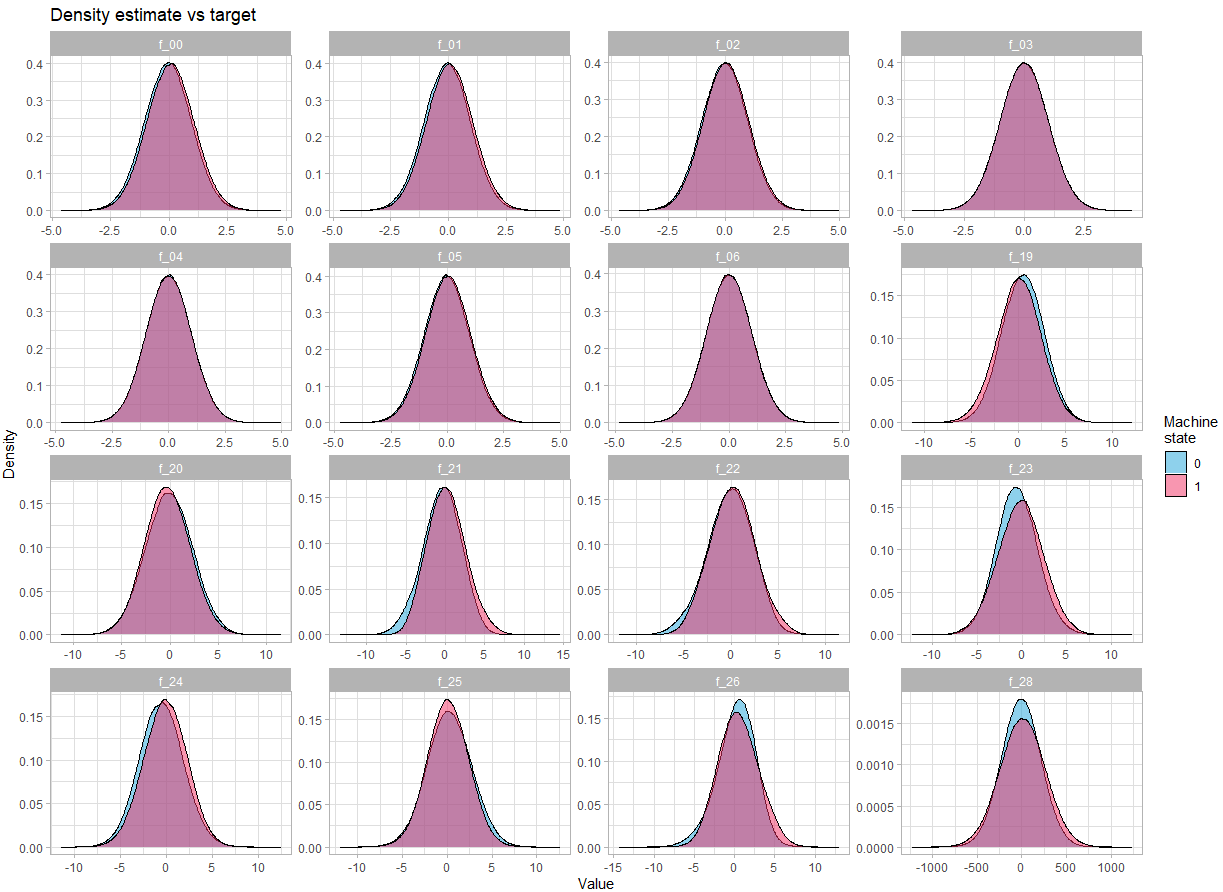
There is no obvious difference in the density depending on the state of the machine.
Let’s look at discrete variables:
train |>
  select(id, f_07:f_18, f_29:f_30, target) |>
  mutate(target = as.factor(target)) |>
  pivot_longer(cols = -c(id, target)) |>
  count(name, value, target) |>
  ggplot(aes(x = value, y = n, fill = target))+
  geom_col(position = "identity", alpha = 0.5)+
  scale_fill_manual(values = c("0" = "#1EA4D9", "1" = "#F22E62"))+
  scale_y_continuous(label = scales::comma) +
  facet_wrap(~name, scales = "free") +
  labs(title = "Distribution vs target",
       x = "Value",
       y = "Count",
       fill = "Machine\nstate") +
  theme_light()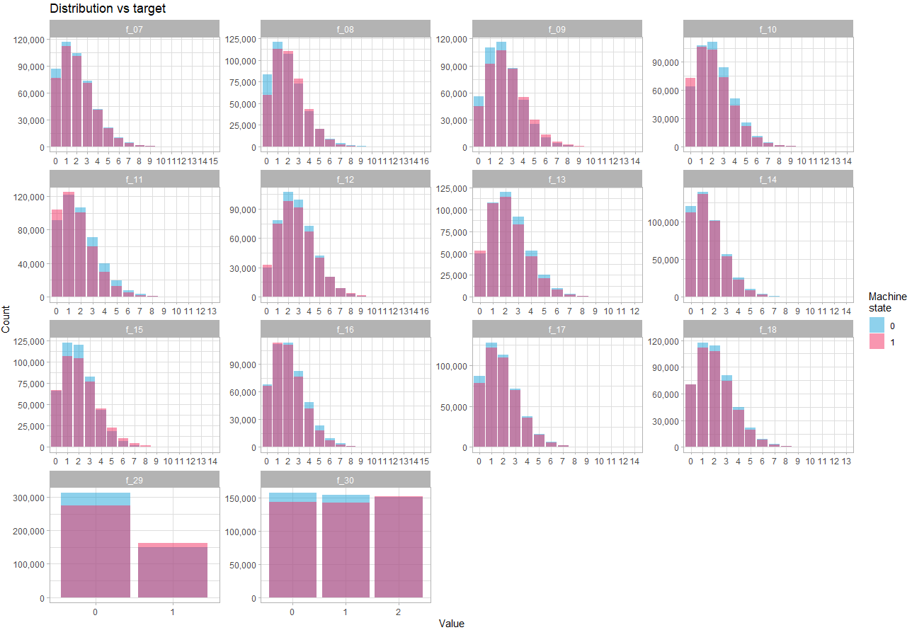
Here we see that the difference in distribution depending on the state is quite subtle, which confirms that the strength of prediction will reside in the interactions between variables.
The last variable is f_27. It includes a combination of letters, and out of 900,000 observations, there are 741,354 distinct observations. Again, it doesn’t seem usable as it is. But looking at the content of the variable, it seems obvious that it looks like the concatenation of 10 variables, each containing a certain number of letters of the alphabet.
If we separate the variable f_27 into 10 variables, and look at its distribution:
train |>
  select(target, f_27) |>
  mutate(target = as.factor(target)) |>
  separate(col = f_27, into = paste0("f_27_", seq(1, 10, 1)), sep = seq(1,10,1)) |>
  pivot_longer(cols = starts_with("f_27_"), names_to = "column", values_to = "letter") |>
  count(column, letter, target) |>
  ggplot(aes(x = letter, y = n, fill = target))+
  geom_col(position = "identity", alpha = 0.5)+
  scale_fill_manual(values = c("0" = "#1EA4D9", "1" = "#F22E62"))+
  scale_y_continuous(label = scales::comma) +
  facet_wrap(~column, scales = "free")+
  labs(title = "Distribution f_27 (letters) vs target",
       x = "Value for each letter position",
       y = "Count",
       fill = "Machine\nstate") +
  theme_light()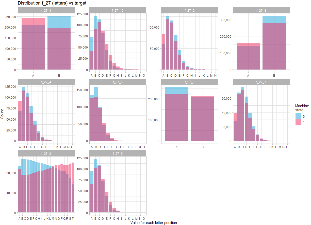
In view of the distribution for each position in the character string, there is no doubt that the variable f_27 must be treated as 10 different variables. Moreover, there are more marked differences in the distribution of these variables between the two states, indicating that these variables are likely to be key in predicting the state.
Discovery of interactions
How to find interactions?
A simple solution is to simply visualize the pairs of variables, for example:
train |>
  sample_n(size = 200000) |>
  select(target, f_20, f_28) |>
  mutate(target = as.factor(target)) |>
  ggplot(aes(f_28, f_20, color = target)) +
  geom_point(alpha = 0.3, size = 0.9) +
  scale_color_manual(values = c("0" = "#1EA4D9", "1" = "#F22E62"))+
  labs(title = "f_20 vs f_28",
     x = "f_28",
     y = "f_20",
     color = "Machine\nstate") +
  theme_light()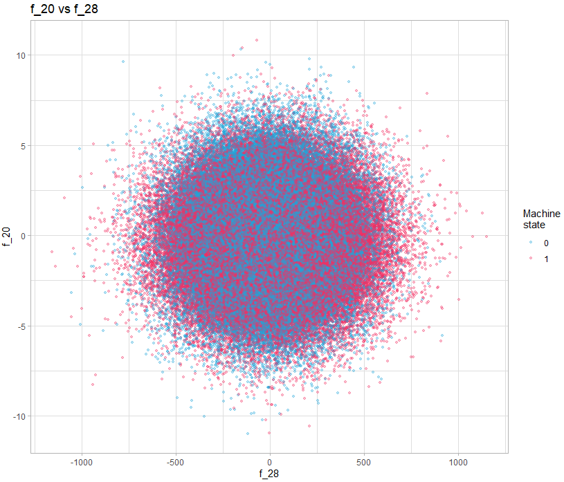
In this example, there is nothing obvious, but if we do it for all the variables, can we discover interesting patterns? Yes you read correctly, looking at all the pairs of variables, with 40 variables, it requires 1600 visualizations. This is where a language like R gives all its power, because of course we will generate all the visualizations automatically and in a structured way so that they are easy to watch.
For graphs containing a discrete variable, all observations will overlap on the value of the variable:
train |>
  sample_n(size = 200000) |>
  separate(col = f_27, into = paste0("f_27_", seq(1, 10, 1)), sep = seq(1,10,1)) |>
  select(target, f_20, f_27_10) |>
  mutate(target = as.factor(target)) |>
  ggplot(aes(f_27_10, f_20, color = target)) +
  geom_point(alpha = 0.3, size = 0.9) +
  scale_color_manual(values = c("0" = "#1EA4D9", "1" = "#F22E62"))+
  labs(title = "f_20 vs f_27_10",
     x = "f_27_10",
     y = "f_20",
     color = "Machine\nstate") +
  theme_light()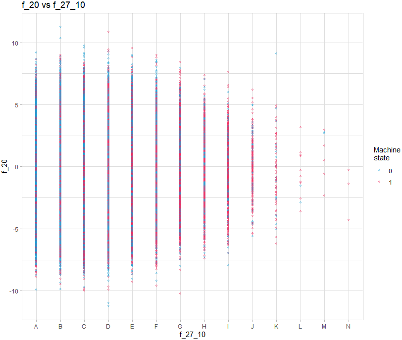
It is therefore necessary to add a random shift on the axis of the discrete value:
train |>
  sample_n(size = 200000) |>
  separate(col = f_27, into = paste0("f_27_", seq(1, 10, 1)), sep = seq(1,10,1)) |>
  select(target, f_20, f_27_10) |>
  mutate(target = as.factor(target)) |>
  ggplot(aes(f_27_10, f_20, color = target)) +
  geom_jitter(alpha = 0.3, size = 0.9, width = 0.4) +
  scale_color_manual(values = c("0" = "#1EA4D9", "1" = "#F22E62"))+
  labs(title = "f_20 vs f_27_10",
     x = "f_27_10",
     y = "f_20",
     color = "Machine\nstate") +
  theme_light()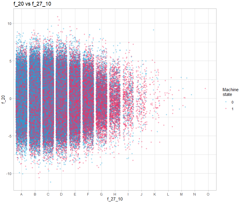
We must therefore make 3 types of graph:
- Continue / continue
- Continuous / discrete (with shift on the axis of the discrete variable)
- Discrete / discrete (with offset on both axes)
The script to generate all the graphs is available on the github repository, but here is how it works on the one including the discrete variables and the offset:
couples_graph_jit_save <- function(data, col1, col2, n = 500, jit_width = 0.4, jit_height = 0.4){

  file_name = glue::glue("graph_{col1}_{col2}.png")
  subdir = col1

  col1 <- sym(col1)
  col2 <- sym(col2)

  p <- data |>
    sample_n(n) |>
    ggplot(aes({{col1}}, {{col2}}, color = as.factor(target)))+
    geom_jitter(alpha = 0.3, size = 0.1, width = jit_width, height = jit_height)+
    scale_color_manual(values = c("0" = "#0477BF", "1" = "#D95B96")) +
    labs(title = glue::glue("variable {col1} vs {col2}"))+
    theme_light()

  if(!file.exists(here::here("graphs", subdir))){
    dir.create(file.path(here::here("graphs"), subdir))
  }

  ggsave(here::here("graphs", subdir, file_name), p, device = "png", dpi = 150, width = 5, height = 5)

}
To use it, we create a grid containing all the combinations of variables, and with the walk2() function of the purrr package, we call the function with the two variables to be used as parameters.
The function creates the different graphs in sub-directories of the “graphs” directory which will be created for the occasion in the project directory if it does not exist beforehand.
The function can use only a sampling of the data to speed up the creation of the graphs and takes in parameter the values of offsets for each axis.
So to create the graphs for the 10 variables from f_27 and all the continuous variables:
col1 <- c("f_27_1", "f_27_2", "f_27_3", "f_27_4", "f_27_5", "f_27_6", "f_27_7", "f_27_8", "f_27_9", "f_27_10")
col2 <- c("f_00","f_01", "f_02", "f_03", "f_04", "f_05", "f_06", "f_19", "f_20", "f_21", "f_22", "f_23", "f_24", "f_25", "f_26", "f_28", "f_29", "f_30")

all_couples <- expand.grid(col1 = col1, col2 = col2, stringsAsFactors = FALSE) |>
  filter(col1 != col2) |>
  mutate(across(everything(), as.character))

walk2(all_couples$col1, all_couples$col2, ~couples_graph_jit_save(train, .x, .y, n = 900000, jit_width = 0.4, jit_height = 0))
You can then go to the “graphs” directory to quickly browse all the graphs.
We then realize that some present interesting patterns, for example the graph showing f_21 vs f_02.
train |>
  sample_n(size = 200000) |>
  select(target, f_02, f_21) |>
  mutate(target = as.factor(target)) |>
  ggplot(aes(f_02, f_21, color = target)) +
  geom_point(alpha = 0.3, size = 0.8) +
  scale_color_manual(values = c("0" = "#1EA4D9", "1" = "#F22E62"))+
  labs(title = "f_21 vs f_02",
     x = "f_02",
     y = "f_21",
     color = "Machine\nstate") +
  theme_light()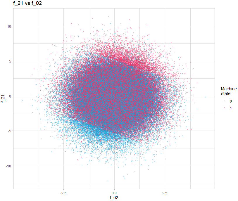
We can clearly see 3 zones clearly delimited by a line. The idea of adding these two variables was proposed in the following post: https://www.kaggle.com/competitions/tabular-playground-series-may-2022/discussion/323892
We then create a new variable which will contain 3 values (-1, 0, 1) corresponding to the 3 zones. How to find these values? Again, this can be done graphically, by visualizing the distribution of the sum of the two variables:
train |>
  mutate(f_inter = f_02 + f_21) |>
  ggplot(aes(f_inter, fill = as.factor(target))) +
  geom_histogram(alpha = 0.7, position = "identity", bins = 300) +
  geom_vline(xintercept = -5.3, size = 0.8, color = "red", linetype = "12") +
  geom_vline(xintercept = 5.2, size = 0.8, color = "red", linetype = "12") +
  annotate("text", x = -5.3, y = 3000, label = "-5.3", hjust = 1.2, color = "red", fontface = "bold") +
  annotate("text", x = 5.2, y = 3000, label = "5.2", hjust = -0.2, color = "red", fontface = "bold") +
  scale_fill_manual(values = c("0" = "#1EA4D9", "1" = "#F22E62"))+
  labs(fill = "Target",
       title = "f_21 + f_02 distribution",
       x = "f_21 + f_02",
       y = "Count") +
  theme_light() +
  theme(plot.title = element_text(hjust = 0.5))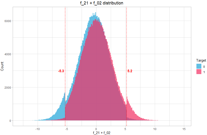
We can clearly see that the distribution comprises 3 distinct parts, so we will associate 3 values, the value -1 if f_21+f_02 < -5.3 (mostly class 0), 1 if f_21+f_02 > 5.2 (mostly class 1) and the value 0 otherwise (balanced).
This new variable makes it possible to take into account the interaction discovered visually, and will help give a boost to the classification algorithm.
The principle is similar for the other variables.
Creation of the model
Note: I am not going to explain how deep learning works here, but show the architecture used with Keras for our specific case. I won’t go into the details of cross validation either, the full code is available on github.
Ok we found some information graphically, created new variables, but how do we use them to predict the state of the machine?
We will use Keras to build and train a neural network, with an input layer the size of the number of variables, and output 1 single neuron with a “sigmoid” activation function which will allow us to obtain the probabilities (therefore between 0 and 1) that the status is 1. Between the two, we stack hidden layers, whose structure has been defined by cross validation for different architecture tests, until we find the combination that gives the best results.
The structure of the selected network is therefore as follows:
Model: "sequential"
__________________________________________________________________
 Layer (type)          Output Shape            Param #
==================================================================
 dense_4 (Dense)       (None, 64)              2880
 dense_3 (Dense)       (None, 64)              4160
 dense_2 (Dense)       (None, 64)              4160
 dense_1 (Dense)       (None, 16)              1040
 dense (Dense)         (None, 1)               17
==================================================================
Total params: 12,257
Trainable params: 12,257
Non-trainable params: 0
__________________________________________________________________
Like many machine learning algorithms, a neural network uses a learning rate, and instead of using a fixed rate, we will decrease the rate by defining a function that will give the learning rate a form of cosine according to the number of epoch:
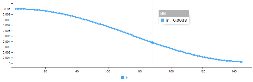
The cosine_decay() function to vary the learning rate is defined as below:
EPOCHS_COSINEDECAY <- 150
CYCLES <- 1

cosine_decay <- function(epoch, lr){
  lr_start <- 0.01
  lr_end <- 0.0002
  epochs <- EPOCHS_COSINEDECAY

  epochs_per_cycle <- epochs %/% CYCLES
  epoch_in_cycle <- epoch %% epochs_per_cycle

  if(epochs_per_cycle > 1){
    w = (1 + cos(epoch_in_cycle / (epochs_per_cycle-1) * pi)) / 2
  }else{
    w = 1
  }
  return(w * lr_start + (1 - w) * lr_end)
}
We use for each hidden layer a “swish” activation function and for the output layer a “sigmoid” activation function. Finally we add an L2 regularization for the hidden layers.
Put together, the model is defined with R and Keras as follows:
model <- keras_model_sequential() %>%
  layer_dense(units = 64, activation = "swish", input_shape = c(length(train_df)), kernel_regularizer = regularizer_l2(l = 30e-6)) %>%
  layer_dense(units = 64, activation = "swish", kernel_regularizer = regularizer_l2(l = 30e-6)) %>%
  layer_dense(units = 64, activation = "swish", kernel_regularizer = regularizer_l2(l = 30e-6)) %>%
  layer_dense(units = 16, activation = "swish", kernel_regularizer = regularizer_l2(l = 30e-6)) %>%
  layer_dense(1, activation = "sigmoid")
We use the “adam” optimizer, defined as follows:
optimizer <- optimizer_adam(learning_rate = 0.01)We now need to compile the model, passing the parameters of the model, for the loss function, for binary classification, we use “binary_crossentropy” and as metric we use “AUC” which is the evaluation used for the competition.
model %>%
  compile(
    loss = "binary_crossentropy",
    optimizer = optimizer,
    metrics = "AUC"
  )
We can then train the model with the fit() function, passing as a parameter a matrix containing the training data, the state of the training data (the class to be predicted), epoch, batch size and the percentage for the validation data.
We also define two callback functions, one to indicate to use the cosine_decay function, and one to stop learning prematurely (early stopping) if the loss of the validation set has not improved for 12 epochs.
model %>% fit(
     train_mx,
     train_target,
     epochs = 150,
     batch_size = 4096,
     validation_split = 0.1,
     callbacks = list(
       callback_early_stopping(monitor='val_loss', patience=12, verbose = 1, mode = 'min', restore_best_weights = TRUE),
       callback_learning_rate_scheduler(cosine_decay)
     )
 )
Keras produces training data for each epoch (loss and auc for training and validation data, as well as learning rate)
Epoch 1/150
178/178 [==============================] - 5s 23ms/step - loss: 0.2217 - auc: 0.9722 - val_loss: 0.1469 - val_auc: 0.9884 - lr: 0.0100
Epoch 2/150
178/178 [==============================] - 3s 16ms/step - loss: 0.1274 - auc: 0.9913 - val_loss: 0.1191 - val_auc: 0.9925 - lr: 0.0100
.
.
.
Epoch 144/150
178/178 [==============================] - 3s 15ms/step - loss: 0.0565 - auc: 0.9984 - val_loss: 0.0675 - val_auc: 0.9975 - lr: 2.3916e-04
Epoch 145/150
178/178 [==============================] - 3s 15ms/step - loss: 0.0565 - auc: 0.9984 - val_loss: 0.0674 - val_auc: 0.9975 - lr: 2.2720e-04h: 133.
Epoch 145: early stopping
It displays a series of curves showing the evolution of each indicator over the training:
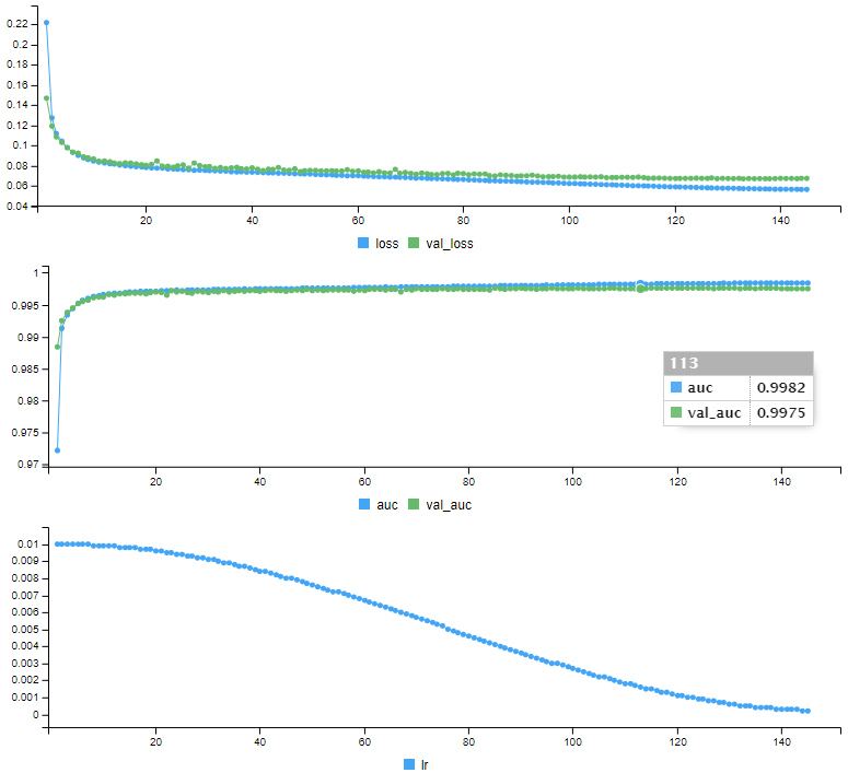
Our model is trained, it is ready to make predictions. Before predicting the test data whose status we do not know, we will make predictions on the validation data, which we can compare the predictions with the real status:
We use the predict() function:
statut_proba <- model %>% predict(as.matrix(validTransformed))Which contains probabilities for each observation:
> head(statut_proba)
             [,1]
[1,] 9.954630e-01
[2,] 2.310278e-07
[3,] 3.195361e-05
[4,] 5.789851e-09
[5,] 9.999977e-01
[6,] 3.583938e-05
We then calculate the AUC:
predictions <- tibble(target = valid_target, prob = statut_proba[,1])
roc_may <- roc(predictions$target, predictions$prob)
auc(roc_may)
Area under the curve: 0.9979
What does it give in terms of prediction?
To make it easier to visualize, we transform the probabilities into classes taking as probability threshold 0.5 (everything below 0.5 is of status 0, what is above is of status 1), and we can visualize the confusion matrix:
          Truth
Prediction     0     1
         0 45484  1020
         1   927 42569
Out of 90,000 observations of the validation data, the algorithm predicted the correct status for 88053 observations. There are 1020 false negatives and 927 false positives, which corresponds to 97.83% correct predictions.
Submitting the test data predictions on Kaggle, the AUC is 0.99819
Conclusion
This example shows that even with data that at first glance seems difficult to exploit, we are able to make good predictions by combining discoveries during data analysis and the ability of deep learning to find interactions.
Using a library like Keras makes it easier since the API is clear and productivity oriented, we can focus on experimentation. This also shows that R is a language that does not have to be ashamed of Python since it allows you to use the same deep learning libraries (Keras, TensorFlow and Torch) and to obtain the same results.
References
My solution for the competition: https://github.com/cnicault/tabular-playground-series/tree/main/May-2022
Competition on Kaggle: [https://www.kaggle.com/competitions/tabular-playground-series-may-2022/data](https://www.kaggle.com/competitions/tabular-playground-series-may-2022/data
Christophe Nicault
Information System Strategy
Digital Transformation
Data Science
I work on information system strategy, IT projects, and data science.